There are many things we anxiously await every year, and for us design aficionados, we’re bursting at the seams to know the newest color palette trends. One trend we jump on every year is the Pantone Color of the Year. We’ve only just dipped our toes into 2022, so there is ample time to jump on incorporating Very Peri into your decorating life. Let us show you some of our favorite ways of showcasing this new hue.
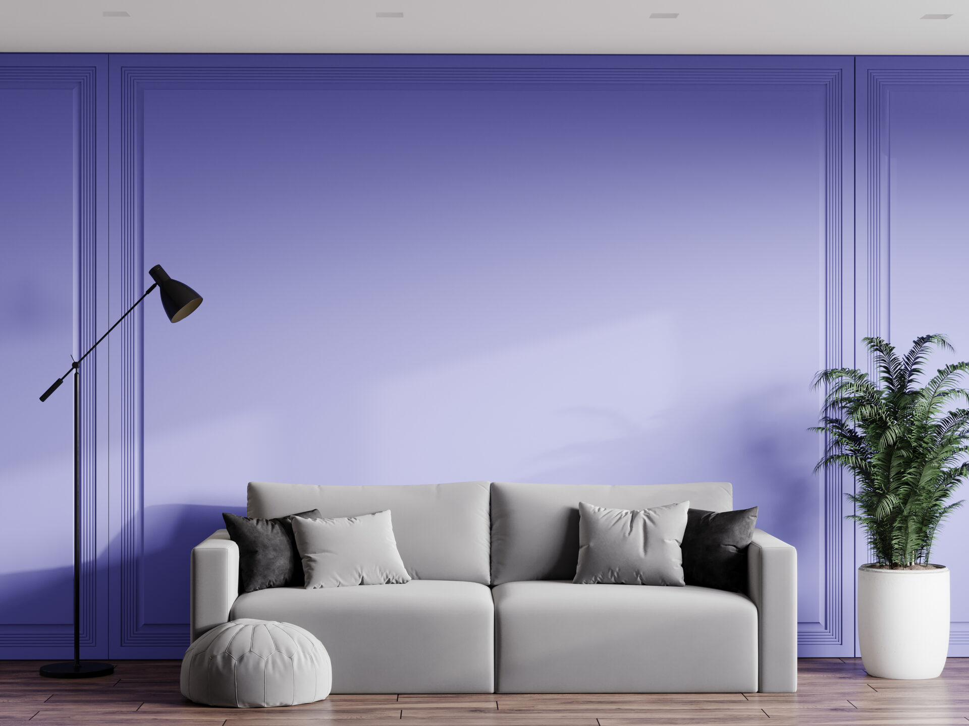
Interior Paint Color: Very Peri
Pantone’s Very Peri, a bright and cheery combination of blues and subtle violet-red undertones, will infuse any room with vivaciousness. Pantone’s Very Peri was chosen as a nod to the “transformative times” we live in, symbolizing the change and transition all of us feel in our current lives.

Very Peri is loud and a bit in-your-face, making it a great accent color to use on the showcase wall of bedrooms and bathrooms, or, as some homeowners call it, the “accent wall.” If you opt for Veri Peri to be your primary interior paint color for a room, pair it with cool colors and neutrals. It can be accentuated by stark white baseboards and molding and looks sleek next to white lacquered furniture and grey marble. For that added bit of contrast, hang a jet-black light fixture.
If you are a customer that is loyal to a paint brand, fear not, because most national paint companies can easily mix this color for you. Need reassurance before taking the leap with a bold paint color like Veri Peri? No worries – you can start by purchasing a small paint sample (no harm in testing the waters, first)!
Accentuate Your Living Space
Bright interior paint colors may not be your thing, but that doesn’t mean you have to forget about Veri Peri. If you’re looking to venture down a more subdued road, use lavenders, lilacs, and periwinkles in your pillows, throws, candles, and window treatments. Start by hanging long curtains from ceiling to floor for high impact. If you’re not looking to break the bank, you can find many affordable window treatments in varying lengths and materials online at some of your favorite retailers.
Accent rugs are budget-friendly, commitment-free alternatives that still make a big splash in any room. If you are frequently changing up your accent rugs, Velcro-based rugs allow you to switch out your design using the same carpet pad. The Urbano Lilac Rug is great for those who love to switch it up or need a washable option (hello fellow pet owners!).
Finish off the room with a few amethyst and blue pillows on any beige couch, and voila! Very Peri. If you don’t know where to begin or even how to get inspired, Pinterest and Instagram are great places to start.
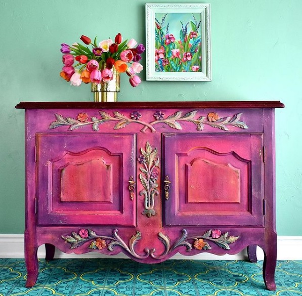
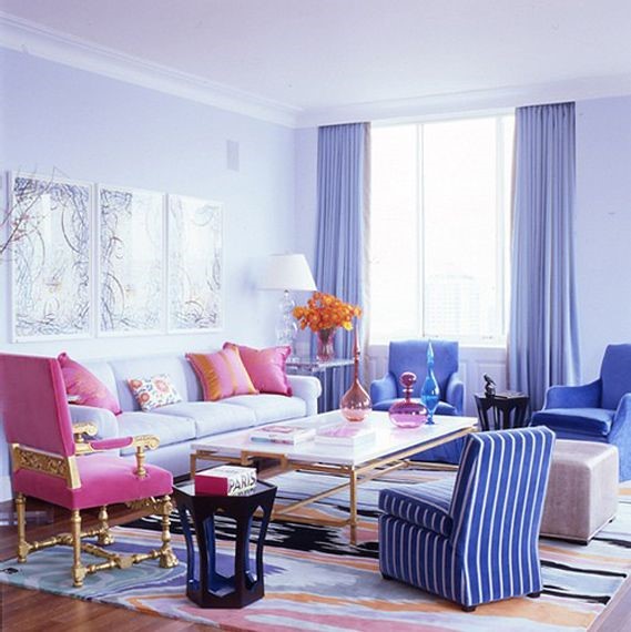
The beauty of decorating with an accent rug or room accessory is that you don’t need to stick to a solid color. Take the room in the above image, for example. There are pops of color, rather than one solid color, including lilacs and purples that would give any room a more fun esthetic.
Very Peri-fy Your Bedroom
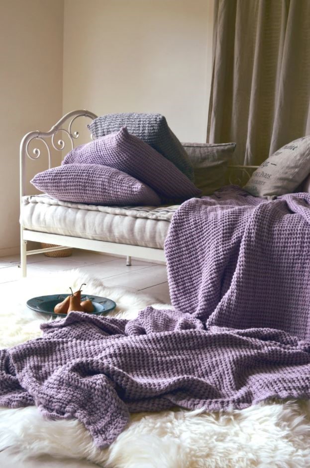
Change up your bedroom linens to match the Pantone Color of the Year. Lilac options are plentiful – one of our favorite linen option sports an interesting waffle texture.
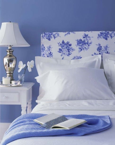
Headboards can also be an unexpected place for that extra pop of bright color. While we tend to opt for more neutral fabrics when choosing our upholstered headboards, bring in violet with a floral or gingham pattern. If you’re feeling bold, try a pop of toile with this custom Art Deco Headboard . There’s no way this vibrant bedroom accessory would go unnoticed . . . you’ll be able to appreciate it each night you head to sleep.
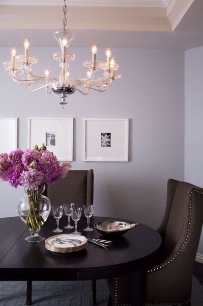
Use This Accent Color in Your Dining Room
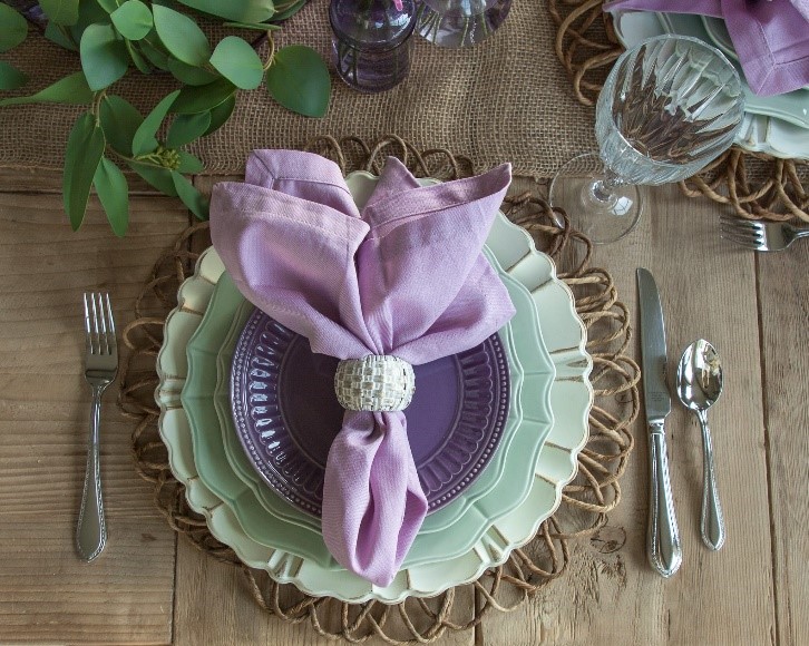
Dining room need a little pick me up? You can dress your entire dining table up with a mint and lavender tablescape, which is the perfect balance of brightness and calmness. This table setting incorporates beautiful moss and mint plates with lavender dessert plates and napkins, making it excellent for spring and summer soirees. Whether live or artificial, your centerpiece can include purple flowers and eucalyptus. This tablescape not only incorporates Very Peri, but also two other complementary colors: Benjamin Moore’s Color of the Year, October Mist, and Sherwin-William’s Color of the Year, Evergreen Fog.
Need other options? Choose clear glass taper holders and accent them with light purple taper candles. We are also swooning over a lighter version of Very Peri as the main color chosen for the dining room walls. It adds a touch of femininity and a feeling of serenity to dining rooms with dark, rich mahogany furniture.
It’s fabulous to embrace a new design trend, but what happens to all of your old home décor? If you’re into interior design and are swapping out more than your wall color, a self storage unit may be the perfect place for the items you’re not currently using. Prime Storage offers many storage solutions, including climate controlled units that are a great choice for extra furniture and linens.